Top 5 Retail Projects of 2019
The year 2019 has seen some ground-breaking retail projects that have forced designers and retailers to look at new ways to elevate the shopping experience. As we step into a new year of possibilities here’s a look back at some of the most innovative retail projects of the year 2019.
SND in Chongqing, China by Various Associates
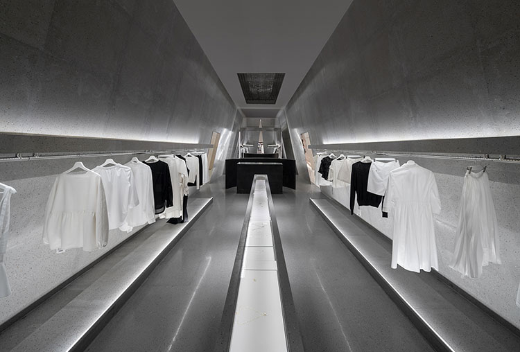
A temple of luxury. It’s a concept a designer may have in the back of their mind when conceiving a retail space. Various Associates took the idea a step further at an outpost of SND, a clothing and jewelry boutique inside the upscale Shin Kong Place shopping center in Chongqing, China. Confronted with a long and narrow 3,100-square-foot plan surrounded by a glass facade on three sides, co-founder Yang Dongzi utilized mirrors to create a funhouse effect as customers meander through narrow corridors. Jewelry is displayed in the long straight showcase right in the middle, which is easy for customers to choose carefully. Luxury brands of haute couture are displayed on both sides, and are illuminated with professional soft lightening so as to show the texture of the clothes. The results earned the designers a 2019 Best of Year Award for Fashion Retail.
Neiman Marcus in New York City’s Hudson Yards by Janson Goldstein
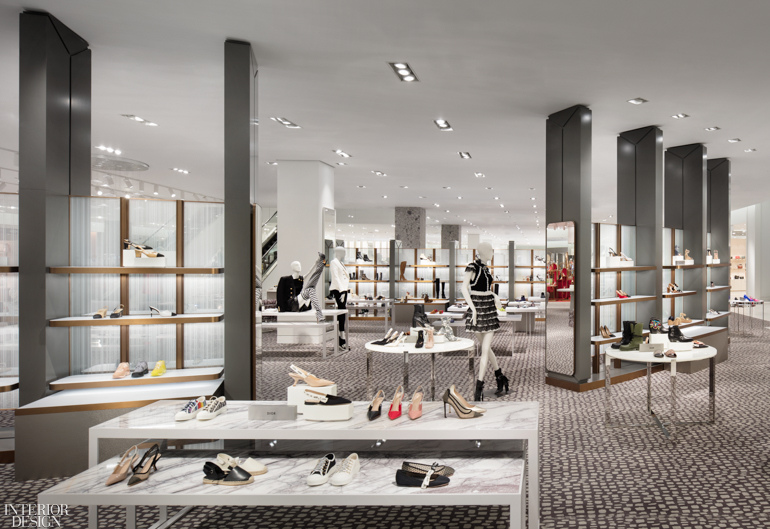
Whatever one thinks of the massive, city-changing undertaking at Hudson Yards, anchoring the neighborhood with Manhattan’s first Neiman Marcus is an undeniably bold choice. As is the store’s design, conceived by Janson Goldstein and intended to bridge the area’s industrial past with its high-end present. The 188,880-square-foot, three-story flagship offers two entrances: a 30-foot-tall lobby with an elevator directly to the upper floors and a main entrance on the fifth floor with striking views of Thomas Heatherwick’s “Vessel.” The Fine Apparel spaces are defined by arrangements of glass and steel mesh screens within sculpted aluminum panels. The project was a 2019 Best of Year Award honoree for the Department Store.
Lawrence & Mayo in Pune, India by Insync Shop Fittings
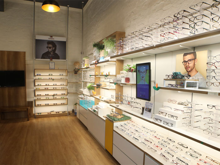
L&M was designed by Design Dollops and INSYNC worked closely with Design Dollops to ensure that the feedback process was a seamless part of the shopping journey. Insync’s Engage Fit N Light Smart Shop Fitting powered up 22″ touch interfaces and were moved around the store based on where it is most effective, since there was no external power connections required. These touch interfaces were loaded with feedback forms designed as games so that they are fun and in turn reduce the resistance from the shoppers.
So today L&M is able to collect vital customer data that is not only assisting them to sell better today but is also building a data rich customer centric future. Besides this the store has only 4 suspended lights on the ceiling that help light up the central area. All the sales areas are lit with the integrated lights embedded into the shelves, ensuring the customers get a more comfortable and natural light setting increasing the time they spend at the racks.
The L&M team claims that this store is performing significantly better on sales in the store that they shut down in the same location.
Joseph Cheaney London in Thomas Heatherwick
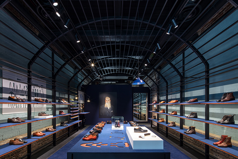
Lewis Cubitt’s famed King’s Cross Station in London debuted in 1852, and just a few decades before, further north, Joseph Cheaney opened its first shoe factory in Northamptonshire. By the time Thomas Heatherwick founded a studio at the dawn of the 21st century, the King’s Cross neighbourhood was ripe for renovation—which he duly undertook, joining two 19th-century buildings into the Coal Drops Yardshopping center. Heatherwick found inspiration for the interiors in the vaulted spaces, framed in powder-coated steel. And now that the center has opened, he’s added a snug boutique for Joseph Cheaney’s beloved handmade shoes.
Timberland in London by Dalziel & Pow
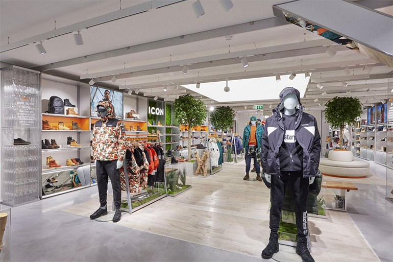
Timberland is designed for a purpose-led flagship that highlights the brand’s sustainability credentials and serves as the model for new stores globally moving forward. Drawers containing material samples enable customers to take a closer look at customising options, while rolling content on digital screens within the area provides inspiration. Filled with living greenery and stories of the brand’s eco-friendly initiatives, the concept fuses nature with fashion and provides Timberland with a fresher, more contemporary space compared to its previous stores.

